
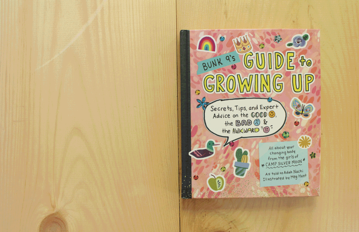


Bunk 9’s Guide to Growing Up is a female-empowering puberty book. Based on the conceit that the older girls at a summer camp have left behind their journal with all their puberty tips and tricks, it is a new way to introduce the changing body to girls.
Bunk 9’s Guide to Growing Up is a female-empowering puberty book. Based on the conceit that the older girls at a summer camp have left behind their journal with all their puberty tips and tricks, it is a new way to introduce the changing body to girls.
As the book designer, I was responsible for creating a look and feel that translated the fresh, new perspective for this puberty book. I also worked closely with the illustrator, Meg Hunt, providing feedback from the editorial staff.
The design process began with doing research: gathering inspiration and looking at other puberty books and books done in a journal-like style.
Iteration was the key to the cover design. Based on the inspiration and research, I started with the idea of collaging from a magazine, which led to collaging with the girls’ photos. I played around with handwritten pieces, glitter, stickers, doodling on top of photos, and patterns. All trying to give it an authentic journal feel.
Because of the journal aesthetic, each page is different! There are callouts from different campers, photos, illustrations, comics, and so many different elements. I also got to hand write the cover and certain pieces on the interior.
Author: Adah Nuchi
Illustrator: Meg Hunt
Editor: Justin Krasner
Designer: Carolyn Bahar
Production Manager: Julie Primavera
Production Editor: Beth Levy
Publisher: Workman Publishing